Gunnar Danbolt
SOME PORTRAITS BY LILLIAN PRESTHUS
The eyes of this dead lady speak to me,
For here was love, was not to be drowned out.
And here desire, not to be kissed away.
The eyes of this dead lady speak to me.
Ezra Pound on Reclining Venus by Jacobo del Sellaio.
Art out of art
The great German art historian Heinrich Wölfflin claimed that art arises from art. This was a radical assertion one hundred years ago, because according to Romanticism and modernism art should come from within the artist, uninfluenced by exterior factors. Art was expression, not imitation; the expression of a unique personality and therefore original. This had not always been the case, because in the Renaissance and the Baroque era originality did not have the same status as it came to have in Romanticism: and after modernism there was the start of the problematisation concerning the relationship between original and copy, which, at times, had been taken up in modernism itself. In Marcel Prousts In Search of Lost Time the main character, Marcel, is disappointed the first time he sees the Romanesque portal of the church in Balbec because it in no way lived up to the plaster fragment which he had seen in the Trocadero Museum in Paris. The original seemed reduced to its own appearance in stone, while the copy in the museum on the other hand was perfect and unchanging because it was not marked by the wear and tear of time, neighbour to an unpleasant café and situated in an ugly town.
This was a dismaying and incomprehensible utterance for modernism and probably remains so for many but after Pop Art it is however considerably easier to swallow. If one accused a modernist artist of being influenced by, for example, Henri Matisse or Paul Klee it was tantamount to taking his originality away from him. Today no one would dream of saying such a thing. Pop Art artist, Roy Lichtenstein did not create unique and original paintings understood in terms of modernism, even though no one had created Lichtenstein-like paintings before him. He worked primarily with images from the mass media, and he confined his practice to selecting and then painting them onto a picture surface: it was a form of work that resembled more that of a designer than a modernist artist. Douglas Crimps characterisation that the fiction of the creative subject has been succeeded by the honest citation and repetition of images already in existence, in which ideas of originality, authenticity and presence are undermined, is therefore quite fitting.
Today, after postmodernism, we have most likely discovered that originality is a flexible concept and that only a few modernist artists were original, according to the theory of modernism they subscribed to. Unlike Andy Warhol and Roy Lichtenstein, modernists disguised the images they modelled their work on in a masterly fashion, so that they seemed to be influenced by no one other than themselves. All of them were, as art always arises out of other art, but that is something they would never have admitted to, as todays artists do open and honestly; and there is something liberating in this.
Standing on the shoulders of our predecessors
It was Aristotle who said that all philosophers and scholars stood on the shoulders of their predecessors, and this holds true for artists as well. Anything else would be quite absurd. Lillian Presthus has never been afraid of admitting this. She makes use of her fathers photographs with his approval and also of the patterns which were designed in the factories at Arne. This was an activity established about 1845 by Peter Jebsen who owned and developed Ytre Arna into a kind of miniature ideal state. Lillian Presthus has returned to and made use of the photographs and patterns which were created in the environment of her home and the rural district she grew up in. Many of the photographs are about close family members, and in several of them we can catch a glimpse of the textiles that were produced in the factories. There is one important difference however her fathers photographs and the textiles from the Arne factories were not perceived as art when they were produced, and are still not today. But when they appear in the paintings of Lillian Presthus they are transformed into an artistic expression. That this is so arises not only from the fact that Presthus is an artist, but also because she is part of a long tradition. We can take one of her paintings, Good Girl from 2004, as a point of departure.
Good Girl
Lillian Presthus works with photo based painting, a technique which goes back to Robert Rauschenberg and Andy Warhol in the beginning of the 1960s. In Good Girl she has mounted a child portrait from her fathers collection of family photographs, probably of herself, in front of a patterned background. But it does not look like a photograph at first sight because she has re-worked it in a painterly way.
The girl takes up most of the left hand side of the painting. She has fair hair with a side parting, the look in her eye is intense, but she is not looking at us, she looks to the right. She is dressed in a white blouse and a red skirt with a front breast panel and straps, white tights and black shoes. To her right we can see part of a horse which almost touches the right hand edge of the skirt. Only the head, part of the muzzle and a front leg are visible the rest of the horse falls outside of the pictures right hand edge. The horse is painted in a light bluish tone which is fairly close to that which we see on the girls left arm and legs. Most likely we are looking at a rocking-horse, even though the eye of the horse looks strikingly alive with its slightly resigned look.
Both the girl and the rocking-horses are outlined with pronounced contours, in the manner of the early modernists Manet, Cezanne and Matisse. And similar to them, Presthus has not modelled what is found between the contour lines to create volume with the help of light and shadow, because there is no consequential use of light here the lighter areas, as for example the right arm and parts of the left, are made independently of a light source, as was usual in both the Late Middle Ages and Early Modernism.
The background is patterned, but in a slightly irregular way. It is made up of rust-red triangles and rhomboids in different sizes and constellations against a white background. And this produces a particular certain effect because the pattern is not integrated so easily into the flatness of the surface, but has something like flickering facets about it. In addition, some of these rust-red triangles and rhomboids have fallen off and lie lightly strewn over the olive green floor. It can almost seem as if the backdrop has become unravelled and is falling to pieces at its lower edge.
Around the girls head and shoulders in front of the backdrop Presthus has placed a Family Portrait, which also exists as an independent painting from 2004. Even though we find more or less the same figures in this picture as those in Family Portrait, it is only the figures which are included, not the surroundings, and the image is also stretched lengthwise (to include most of the figures). Furthermore, the colours used are different, as here they have all been given the same light-bluish tone which the rocking-horse has and that makes the figures both more distant and vague than in Family Portrait.
On a purely formal basis we can compare this picture with Jean Heibergs famous Nude (1913) inspired by Matisse, because we also find here a figure in front of a patterned wall paper. But the differences are just as obvious, because Heiberg is working with a clearly defined room Presthus is not. Because in her painting it is difficult to know whether we are talking about a room in an everyday sort of way, as the background is not an ordinary patterned wall and the floor is not clearly defined against the background. The front leg of the rocking-horse also makes it seem as though the olive coloured floor lacks depth on the right hand side. In addition, the figures from Family Portrait are placed in front of the background around the girls head and shoulders. This makes the space even more indeterminate.
Dressed in fine clothes, the girl stands beside her rocking-horse, but without any form of contact between them what so ever. The horse is not interested in the girl, and the girl in it. But she stands nicely as if she is held there, yes, in fact almost as if she is nailed to the spot by the family which surrounds her head and shoulders. They function almost in the same way as the speech bubbles, often made use of in images from the Middle Ages do, to make it clear what the figures are saying to each other, because at that time an image was still speech. Presthus has replaced the ribbons of speech with visual signs, as was also often the case in the Baroque. Nevertheless, the function is the same they stand for the many voices which for a long time have told the little girl what she should and should not do, until finally she is frozen fast in the position they want her to show the world.
She is apparently standing on a stage, facing the audience which we as viewers make up, playing the good and dutiful role which the family in the background has channelled her into. And even the tempting rocking-horse by her side has been unable to get her to act beyond the instructions laid down for the role. As a consequence, the rocking-horse, with its slight air of resignation, seems to have more presence than the living girl.
Seen this way the painting sheds light on what it means to be a good girl, namely to allow oneself to be forced into a role almost as if into a constricting plaster form which the middle class family in the background consider correct for good girls. This means that the family here as representatives for a whole generation of middle class families offer the vibrant life of the child for a pillar of salt, formed by the rules and commands, which by chance fit in with how a certain time and a certain milieu understand the way one should behave: that is say, to a very high degree, with a determined cultural role model.
We can hardly avoid recognizing ourselves in this, both because we have been children and remember the pressure of that time, and because many of us as parents have ourselves wanted to form our children into certain roles, maybe unlike the one we see in the painting, but none the less determined by time and milieu.
It is such recognition that can release memories and recollections which make the past appear alive before us with all its sensual impressions in place, as it did for Marcel in Prousts famous novel, when he ate a Madeleine cake dipped in herbal tea. This is an example of involuntary memory which is in fact what the English philosopher of art and social reform, John Ruskin, who gave Proust the idea, called this form of recollection or memory. Voluntary memories are those which we ourselves can summon up, but they will always be superficial like yellowing photographs. But spontaneous memory, which can be produced by a piece of music, a painting, a taste or a fragrance is different because it goes much deeper and brings up aspects which have been suppressed and stowed away, for both better and worse, and which now surface alive from the unconscious. We find here just one of the possibilities of art to bring to the fore, from the unconscious, points of view and aspects which we have forgotten or repressed. In some instances a whole world from childhood unfolds, as it does for Marcel. In other cases there are dark and destructive memories which have hampered us without our having the slightest idea. Seen this way, art can be liberating on several levels, of which Good Girl can be an example.
We shall now move forward and take a look at Portrait of Twins from 2004.
Portrait of Twins (2004)
In this double portrait we see two girls standing beside each other in the centre of the picture. The background is patterned with a motif of vines against irregular areas of colour in relatively light tones, with blue, white and rust-red as the main components. Both at the top and the bottom of the painting there are also placed triangles of Norwegian Hardanger embroidery, which at the lower edge function as a floor, while in the upper edge they are partly overlapped by the vine and the irregular areas of colour. Other motifs can also be seen, as in the upper left hand corner patterned with rust-red triangles and rhomboids against a light background, and which is quite like the background in Good Girl. The two girls have been placed against this variously patterned background. They are on the whole like the girl in Good Girl, but with some changes, such as their gaze which is directed at us, and their longer legs. The girl on the left is wearing more or less the same clothes as the girl in Good Girl, while the girl on the right is a little taller than the other, and is wearing a white dress with large rust-red flowers on it. Both are wearing white tights and black shoes. The position of their feet is however slightly different.
Although the girls resemble each other they are not identical. We have already pointed out that their height and dresses are different, as are their faces and the position of their feet. The differences are not great, but enough for us to be looking at sisters the one on the right slightly older and taller than the one on the left. In spite of this it is the smaller girl on the left who stands out most, because the dress is a block colour and therefore makes a clear contrast to the background. The other girl slips unnoticed into the surrounding pattern, even though she is both larger and takes up more space. Her right leg for example reflects the blue and red tones of the background, which the white tights of the girl on the left do not.
Seen from one perspective this tells us how pattern functions to counter an illusion of three-dimensionality. Because the white dress with the rust-red flowers, or balls, operates as one pattern against another pattern, in which the same colours appear, and visually they glide into each other so that the girl is flattened out and easily disappears into the background. The girl on the left however has a dress in a plain colour which stands out clearly from the background and is thereby indicated more strongly.
A description such as blends into the background is often used metaphorically to characterise certain people who do not manage to create a high profile for themselves as personalities. They remain anonymous, indistinct and without a clear outline, and quite easily become invisible. They are present without really being present. Prominent figures on the other hand stand out clearly and make themselves known.
It is tempting to apply this to the two girls in the painting. It is the smaller of the two who makes her self known, while the other is merely a beautiful wallflower. If we read the picture in this way, and it is absolutely possible to do so, then this is also a study of two different personalities: although it is not necessarily about two sisters, that is to say, about two different individuals. They can also be understood as two aspects of the same personality. One would really like to make a mark in the world, but the other holds back. And perhaps in this case it is the latter that is the victor because she is larger and is situated on the right. It is usual for us to read from left to right, ending up on the right hand side, and there stands the silent girl with no accentuation.
Many people can recognize themselves here. Most likely we would like to distinguish ourselves in some way or another, but at the same time we cannot bear the thought of what it might cost us to stick our neck (a bit too far?) out. This applies to us all, but possibly more to artists than most people. Because it is not enough for an artist to have talent and good ideas if she lacks the courage which is also needed to present herself as an artist and hold exhibitions. In this way the painting if we explore it metaphorically is about far more than some modernist exercises in form and colour. The picture is also that, but it is done with such finesse that it can also have, or be given, meaningful overtones.
Finally the gazes: both girls are looking directly at us, but it is difficult to relate to two people at the same time. And precisely that neutralises them.
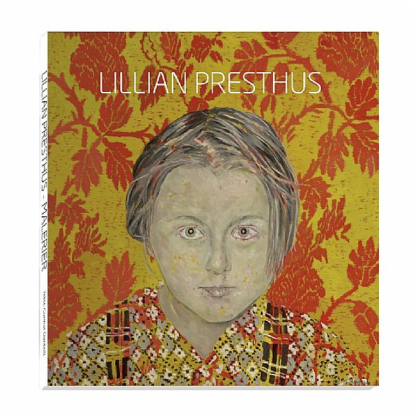
Portrait with Wallpaper (2005)
The painting is a head and shoulder portrait, seen face on, of a child of about ten years old, most likely a girl, although that is not so easy to determine completely without ambiguity. She has short hair which reaches to just below the left ear, but it is pushed slightly back on the other side so that we can see a little of the right ear lobe. She is dressed in a patterned blouse or shirt with shoulder straps which look as though they are in a Scottish tartan. The background is patterned wallpaper with a yellow base overlaid with large, red leafy branches which twist about with what looks like a certain degree of regularity, though this is difficult to ascertain from this relatively limited section.
The girl has been taken from the fathers photographs, and the wallpaper is inspired in part by the patterns from the Arne factories and partly by a Gobelin tapestry Presthus had seen. But the combination of the two takes them into a completely different sphere. Patterned backgrounds, and we have already seen a few examples of these, can make us think of the paintings of Henri Matisse. Like Presthus, Matisse grew up in a small town, Bohain-en-Vermandois, which bore strong traces of the textile industry, and his first visual impressions, were precisely those of textiles. They also reappear like a connecting thread running through his paintings.
What in this case differentiates the painting by Presthus from the paintings by Matisse is the self-portrait it is both large and dominating, and takes one thoughts rather to the portrait of the author Stanislav Przybyszewski in Munchs Jealousy. The look in the eye is equally intense, but turned more outward as if it is scrutinising us.
Presthus has called attention to the face itself it stands out clearly against the background, in contrast to the blouse and straps. To be sure, they are differentiated from the background because they have a different pattern, but the colours are almost the same. The red lines on the blouse follow the lines of the vine in the background more than the blouses own rhomboid pattern: so even the part of the body which is visible takes second place to the face.
Indeed, it is primarily the face, or more precisely the eyes which draw attention to themselves. Presthus has painted the face so that a flat aspect is emphasised by means of the outline around the cheek and chin, as Matisse always did, but at the same time she has called attention to volume especially around the eyes, over the nose and along the cheeks, where she has used a certain amount of modelling. The red tone from the backgrounds branches and leaves is also used here in the form of a number of red flecks in the hair, around the eyes and small dots on the skin.
Presthus also has different versions of this picture, among others one in paler colours and with a slightly different pattern in the background. It is interesting to compare them, as even though the face is the same, the look in the eye is less intense and alive. This does not mean that seen as a picture it is less meaningful, but it demonstrates, where colour is concerned, how small the differences need be for a face to change character. The intense alertness which characterises the first painting is less emphasised in the second. The girl is paler in the last picture and fades into the background more. Not least because the blouse here is painted in different colours to the background and therefore stands out more. Even though the girl is sitting in precisely the same way, it can seem as though in the last painting she is pulling herself slightly back, while in the first she is leaning slightly towards us.
This tells us that here are many levels in these portraits. Formally the paintings are about the relationship between surface and depth, or the tension between them. Patterning works against an illusion of three-dimensionality and when it extends over the girls blouse, this is also flattened out. And to a certain extent, the red lines and dots in the face include the face in this effect. Moreover we have the contour line, which also has a flattening effect. But at the same time the face is modelled, and modelling is a sign of depth. There is also overlapping; the girl is placed in front of the wallpaper etc. Such forces placed in opposition to each other create a structure full of tension. And this is quite in keeping with modernisms emphasis on aesthetic properties or qualities of the senses.
A form analysis like this is of course important, but it does not mean that there is no more to say about the painting. That the face is partly bound to the paintings surface outline, red lines and dots and partly stands out from the surface and addresses us with an intense vivid gaze, extends beyond formal aspects and onto the level of meaning.
The way in which the girl addresses us as viewers, and activates us, is an example of what the American art historian Michael Fried has called theatricality. For the modernist Fried, theatricality was a serious break with modernism, a break which he was extremely critical of when he observed it in Minimalism in the 1960s. But even though he meant it as criticism, the observation was apt, and it has become a part of the reception of Minimalism: because it took into account the whole situation around the exhibited objects, including our embodied way of seeing and our movements as part of the interpretive act. This means that the interactive aspect of the situation was emphasised what one now often calls the performative aspect or the performative imperative, (an aspect which is not only reserved for minimalism). It is this that is activated in the portrait by Lillian Presthus, because the girl claims our attention and demands a reaction. We cannot avoid this gaze, unless we look away; and this is also an action.
As a consequence we are now on the next level. What does this person want from me? And how shall I respond to this gaze? In this situation it is tempting to make use of Emmanuel Lévinass philosophy of the Other. As Lévinas understands it, the Other is not another self, but a person who is fundamentally other. Because the Other is completely other it cannot be reduced to the Same; that is to say it cannot be acknowledged, for we can only acknowledge and comprehend that which can be transformed into an object, an It. And this cannot be done with the Other, because then he or she is no longer the Other, but the Same as all else, for example a Norwegian, a Jew, an enemy etc. But if we are unable to understand the Other, because he or she is foreign, incomprehensible, a monad without doors or windows we can meet the Other. And we find ourselves then in the field of ethics.
When we meet a person who will always be the Other for us, it is gazes that can meet: because Lévinas thinks literally of a face to face confrontation. Like we, in this painting, meet the girls piercing gaze. To begin with, this makes one aware that this girl is quite different to oneself she is puzzling and incomprehensible in all her strangeness. Even so I can open myself up to her to her gaze.
But I can also choose not to meet her. As:
When one looks at a nose, a pair of eyes, a forehead, a chin, and one is able to describe them, then one turns towards the Other as if towards an object. The best way in which to meet the Other is when one does not notice the colour of the eyes! For if one notices this then one is no longer in a social relationship with the Other. Perception can quite certainly dominate the relationship to a face, but that which specifically is the face, is that which cannot be reduced to perception. It is first and foremost
the directness of the face, its unreserved vulnerability, defencelessness the face is what prohibits us from killing.
Lévinas was himself critical concerning the possibility of meeting a painted face in a satisfactory way, because the Other, in its uniqueness cannot be represented in either words or images. Only as the Same as a child, a white, an Arab etc.
Just to paint a face is to make it an It. That is, to the Same. But he is not entirely correct here, because the work of art itself is only a work of art so long as we can relate to it as a living You. That is in fact a requirement to be able to enter into a dialogue with it.
Nevertheless we cannot begin here; at least we have not done so above. We began by describing the painting, and as Lévinas writes above, one turns towards the Other as towards an object when describing him or her. In that way it becomes like all other paintings: it has a certain form, a specific style, palette, a background pattern, some figures etc. As art historians we have been taught to register all these factors, because it is only in this way that we can characterise and categorise the picture and place it in art historys herbarium. To do that is just one of an art historians tasks and we need to be aware that it is the object, It we then describe: not the work of art, because that cannot be described, only experienced in an actual meeting with it. From a description of the object to an experience of the work of art there is a giant leap, and without this difficult jump the work will never be more than an object.
It is here that the girls gaze becomes important, as it is a metaphor for art itself. We must quite rightly move via It, the painting with its many characteristics and qualities in order to arrive at the You, which alone allows us to experience it as art. But this You similar to the girls look lies encapsulated in the work and calls upon us to deliver it. In this way Portrait with Wallpaper is a painting which says something decisive about the leap from a dead object to a living work of art.
Epilogue
In this introduction we have looked at just a few of Lillian Presthuss paintings; works which were created after she took a new artistic direction around 2003. It was then that she decided to use both her fathers family photographs and the patterns which were designed and used at the factories in Arne. It was this decision that returned her to the artistic arena. Of course, she had never completely left it, but Lillian Presthus now had the means to express the visual and artistic reflections which she had been thinking about for some time, but without finding a point of entry. It was here that the old family photographs, and not least the patterns which had created important settings for her childhood, were decisive. Because by using them she released many of the memories and recollections which were forgotten and suppressed, while at the same time she has managed to universalise them so that we as viewers can also recognize ourselves in them. In fact, more than that experience them in our own individual ways.
Jerome J. McGann has written that poetry is a language which draws attention to itself. The poetic use of language may well have polemical, moral or ideological functions, but poetic texts function primarily to reveal their own practice, to let it stand out as a subject of interest. Unlike other self conscious textual constructions, such as propaganda or advertising, poetic texts necessarily return the reader to themselves, creating an awareness of the act of reading. These reflections by McGann on the poetic text are equally valid for pictorial art, and they are applicable to what happens to us when we address Lillian Presthuss paintings. Almost at once, we are made aware of the activity of painting itself how the photographs adapted by painterly means work together with the patterns which fill the backgrounds and how this gives rise to different types of relations and tensions. And not least, how this makes us see new and unexpected connections and levels of meaning, which arise precisely because we are made aware of what we do and think about when we engage with the pictures. That is why it is well worth the effort to write about the paintings of Lillian Presthus.
Gunnar Danbolt
| The movement of colour |
|
| Landscape |
|
| My colors |
|
| Digitalis purpurea |
|
| From the series: Transitions |
|
| In my garden |
|
| Charlie |
|
| Portrait with wallpaper |
|
| Good girl |
|
| PETIT POINT |
|
| Texts |
|
| VIDEO 2022 |
|
| CV |
|
| LINKS |
|
| CONTACT |
![]()
| 1-7 | |
| av 7 | |